Remodeling a home, or building a new one, is an exercise in compromise. Let’s be honest: most budgets are limited. But if you are committed to creating a beautiful space with a great ambiance, you are going to forfeit some dollars on items that you love or which are simply a necessity. In today’s post we are sharing our story about what we saved on and what we splurged on while designing the interior of this light-filled farmhouse.
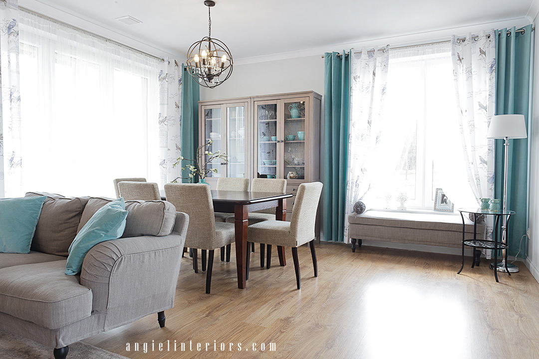
As it was a new-build home the majority of the budget was spent on construction and installations, leaving very limited resources for finishing the interior. The first budget-wise decision made by the owners was hiring us to virtually design their kitchen, living/dining room and entryway. Remote design (or e-design) service is a very cost effective way to make your home dreams come true. It is available for anyone who has time and willingness to deal with trades and shopping, and to manage the whole process. All of that with our guidance, of course.
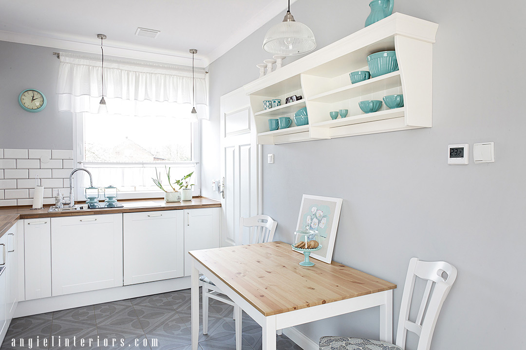
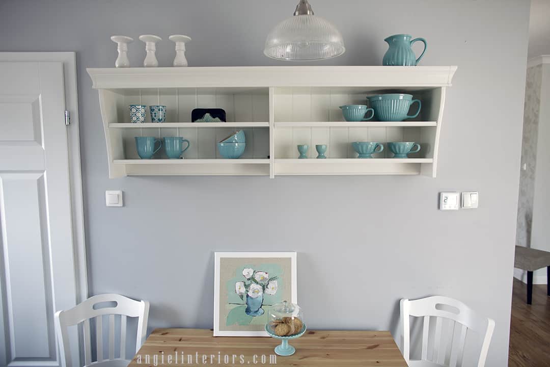
Whether we meet our clients in person or just virtually, we always try to learn as much as we can about their lifestyle, routines and habits. This farmhouse was built for an elderly couple who had a few things on their wish-list. For example, a table in the kitchen was a must, as it had always been the favourite spot to read the morning newspaper. So although we had some smart ideas about how to get the most of this tiny kitchen space, we gave them up to accommodate the clients’ real needs.
We also had to keep in mind the frequent visits from their children and grandchildren, so we needed to provide enough seatings for all those family gatherings. That’s why we fit two sofas in the living/dining room, an additional bench at the window, and some occasional chairs here and there (e.g., in the entryway) that can always be brought to the extendable dining table.
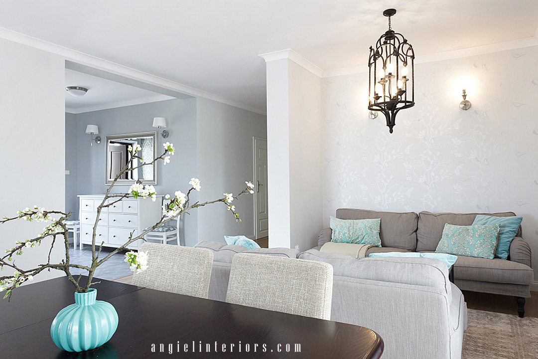
Style-wise we recommended classic lines and neutral colours with a splash of turquoise and we kept this scheme throughout the whole open space, so that is looks unified. Neutral tones work as beautiful foundations and are also one of the ways to save in longer perspective. Whenever you get a bit bored with your interior and decide that you want to go with bohemian influence, or oriental, of rustic, you can do any of those with accent pieces and decor.
Now, here’s a list of more things that we saved on:
- FLOORING
Faux wood laminate flooring is not only more affordable, but also cheaper to install than hardwood. It is also durable and easy to maintain.
- TILES
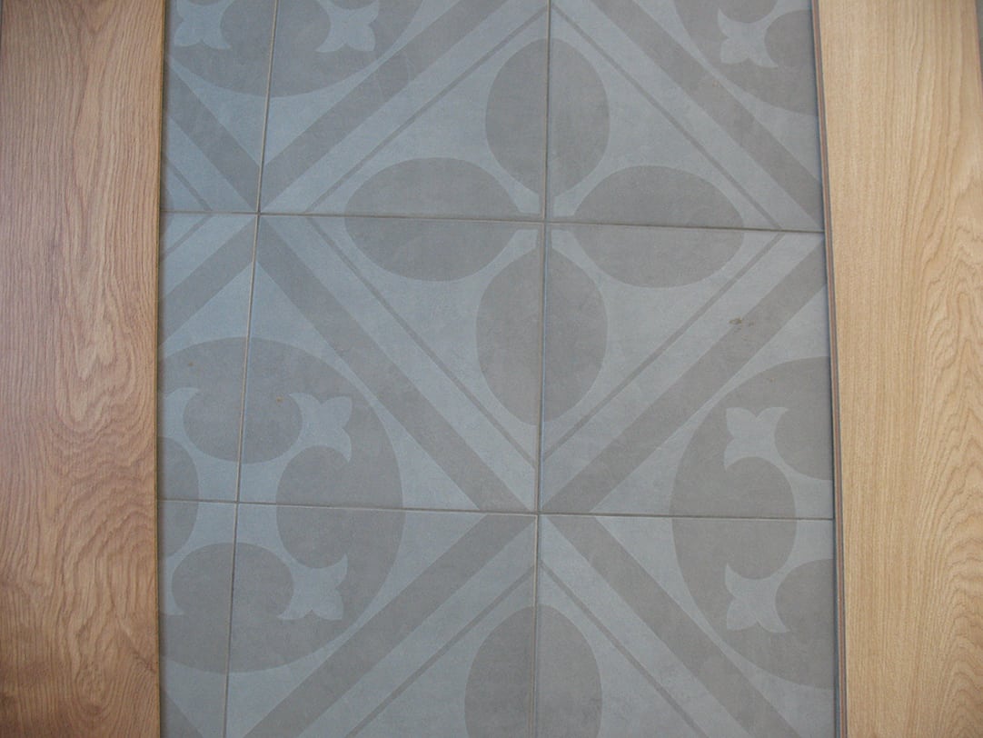
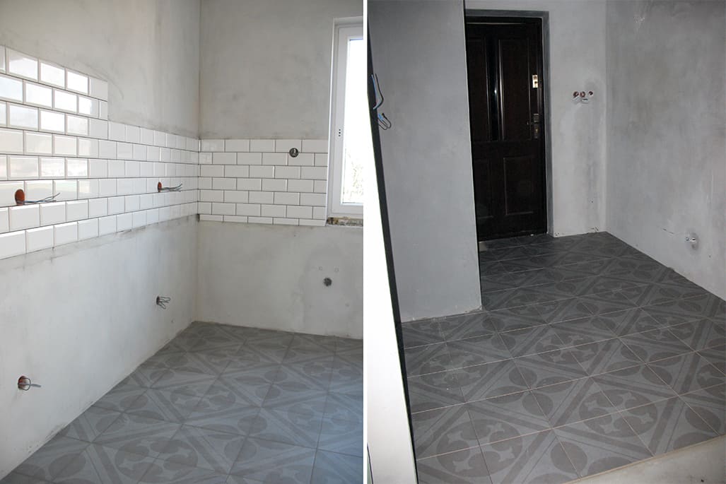
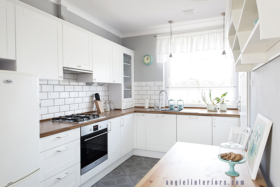
It’s always a better deal to buy in bulk, so we ordered the same floor tiles for both the kitchen and the entryway. Also, both these spaces are visible from the living/dining room, so this unified look works best here. We chose simple subway tiles for the kitchen backslash, as they are inexpensive and will never go out of style.
- FURNISHINGS
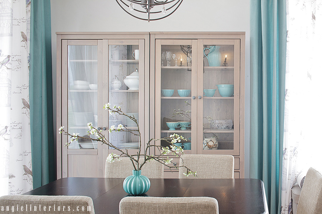
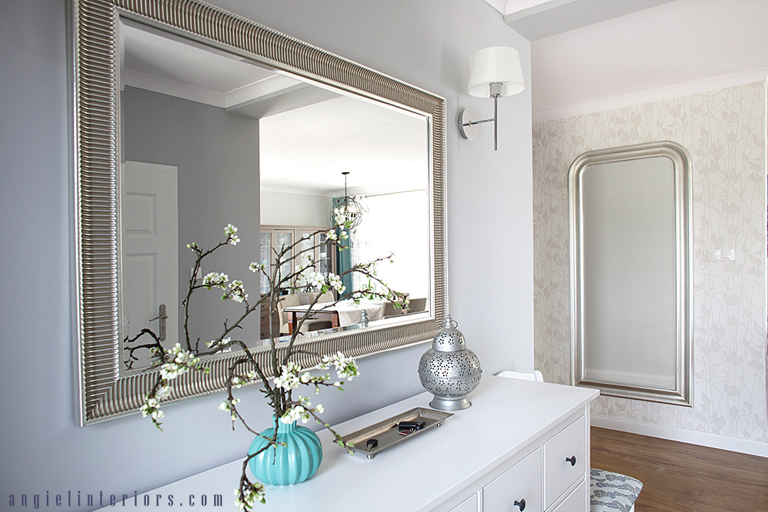
When it comes to upholstered and case goods IKEA is always a budget saver. We used a lot of their products here, like HEMNES cabinets and dresser, VITTSJO and KLINGSBO tables, STOCKSUND sofas and bench. All of those pieces have one thing in common – they have quite tall legs which keeps the room from looking too heavy, therefore they are a perfect choice for small spaces. Slipcover sofas can deliver a great look at a great value and are so easy to keep clean.
- DINING TABLE
It was the only piece from the clients’ previous home that they decided to keep. It was just the right size, sturdy and still in good condition. With the new chairs it looks like it belongs here. Whenever you feel like you need to change your space entirely, have a second look at all the items that you have. Maybe a new coat of paint or an updated styling will give that old bookcase a second life.
- CURTAINS AND THROW PILLOWS
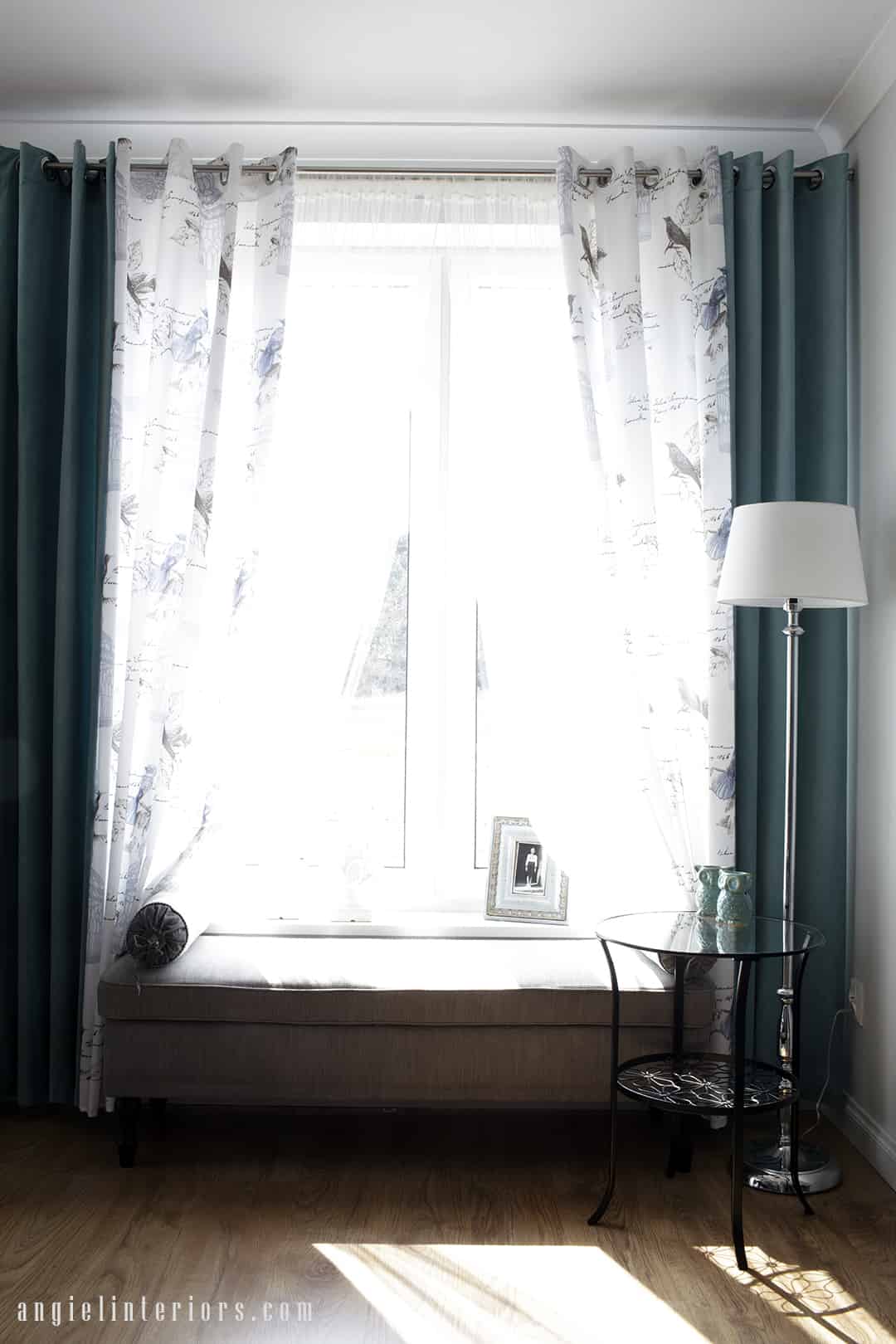
Ready-made curtains and throw pillows are a great way to save. The selection of colours and patterns is so wide now, that you shouldn’t have any problems with finding just the right pieces.
Saving on all of the above allowed us to splurge a bit, too:
- FLOOR HEATING
Although the cost of installing floor heating is higher than installation of traditional radiators, radiant heating gives you substantial saving on your energy bills in the longer term. More space and design freedom without the bulky radiators on the walls represent another advantage.
- KITCHEN CABINETRY
As the kitchen is very small we wanted to make use of every inch of it. So we designed custom cabinets which fill the space perfectly from wall to wall. Built-in appliances helped us keep the sleek look.
- ENTRY CLOSET
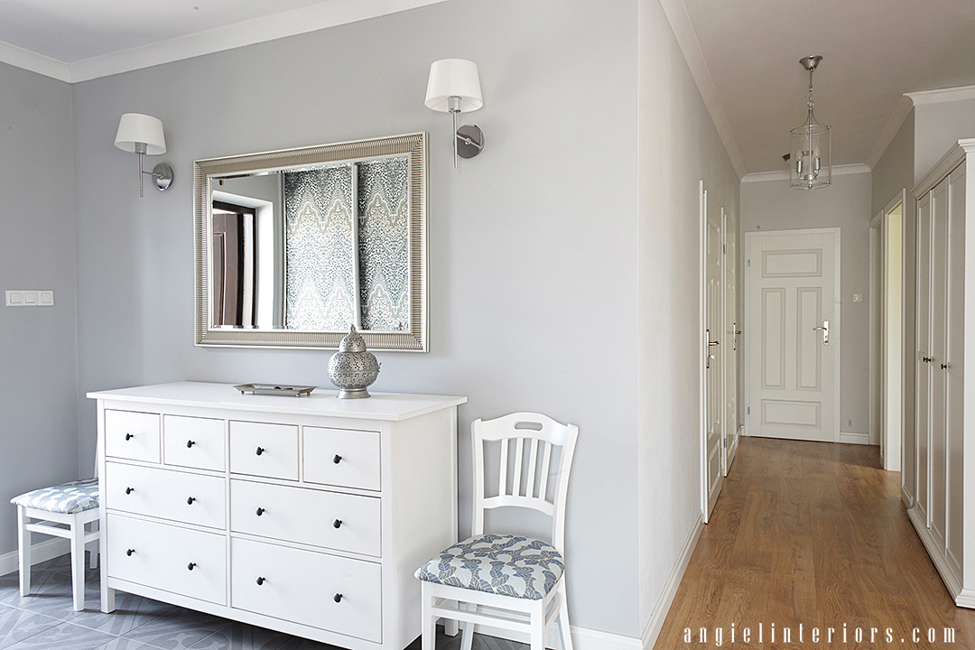
Again, to maximize the use of space we went with custom built-in entryway closet. The closet doors were also covered with wallpaper to add some visual interest.
- AREA RUG
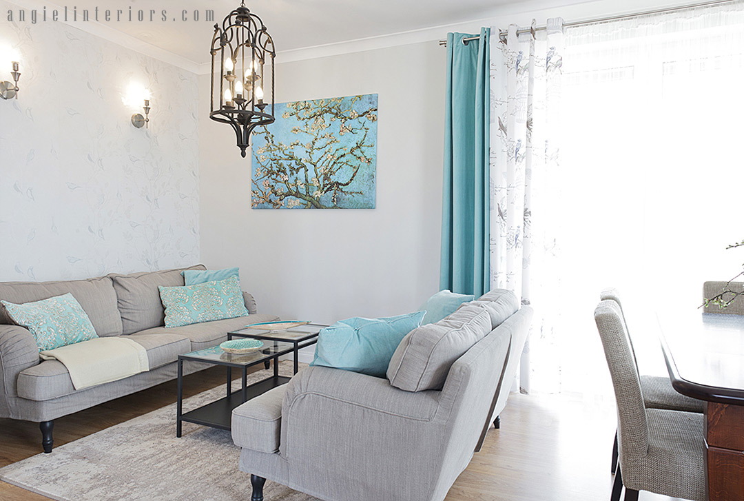
We didn’t need a large area rug to pull the sitting space together, so our choice was a great quality 100% wool one. Wool actually repels dirt, whereas synthetic fibers hold on to dirt and never let it go. A wool rug is a must in heavy traffic areas and it is the most durable option that will look as good as new for many, many years.
- LIGHT FIXTURES
Lighting is the jewelry of your home and is totally worth splurging on. It can elevate a room to a new level. This space needed some statement pieces, so what could be better than a pair of dramatic pendants?
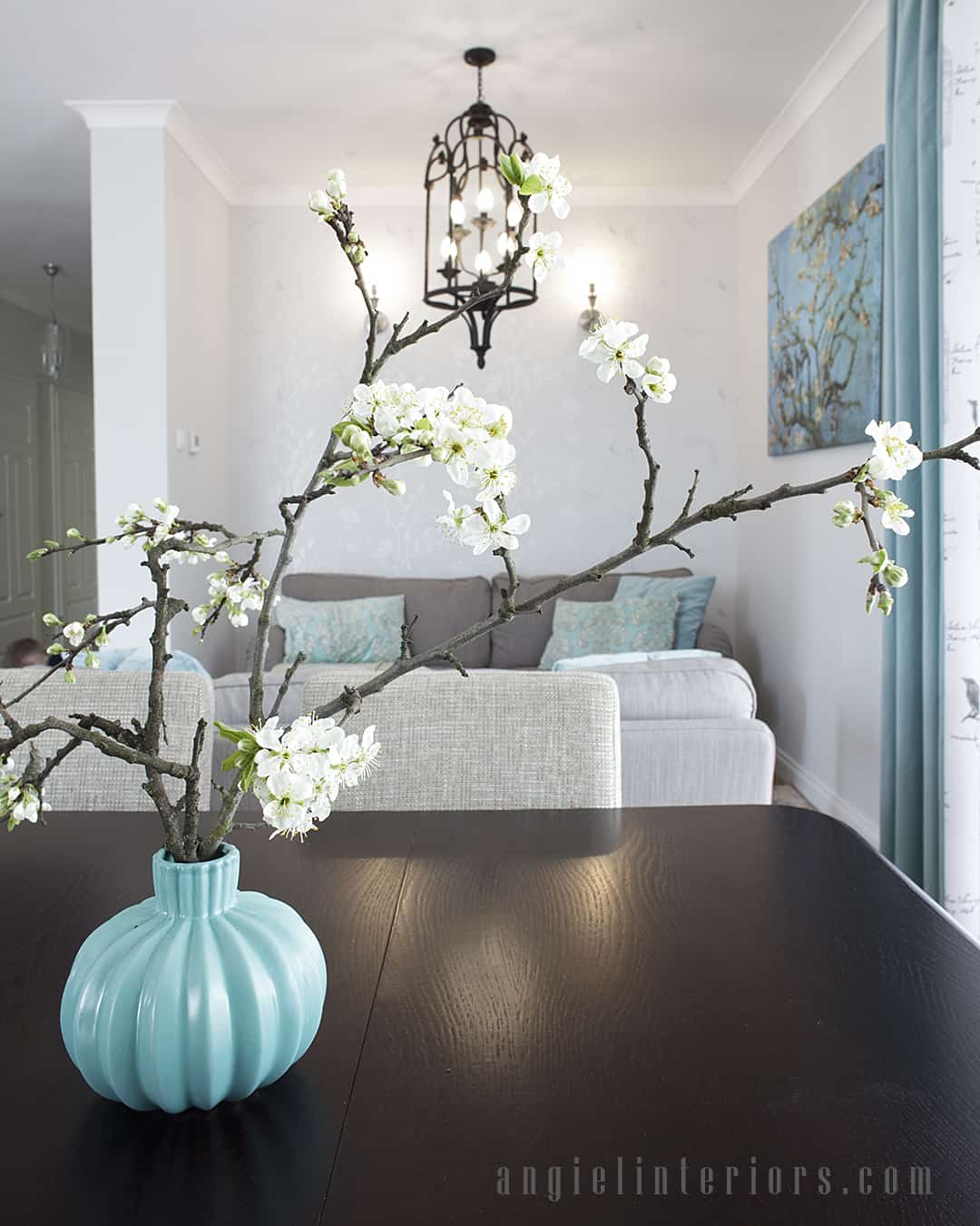
- CROWN MOULDING
A classic and timeless design simply can’t be complete without crown moulding! So although it wasn’t a necessity, we really wanted to bring this elegance and touch of luxury to this interior.
To sum up, if you are going to invest in your home, but you are tight on budget, you should try this “save and splurge” strategy. As you can see, we mostly “saved” while designing this interior, but still were able to achieve a well-balanced, fresh and timeless look. Great design can be done without breaking the bank!
Many thanks to Tomasz Kołodziejski for the photo session.
